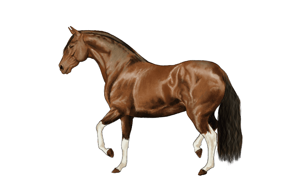
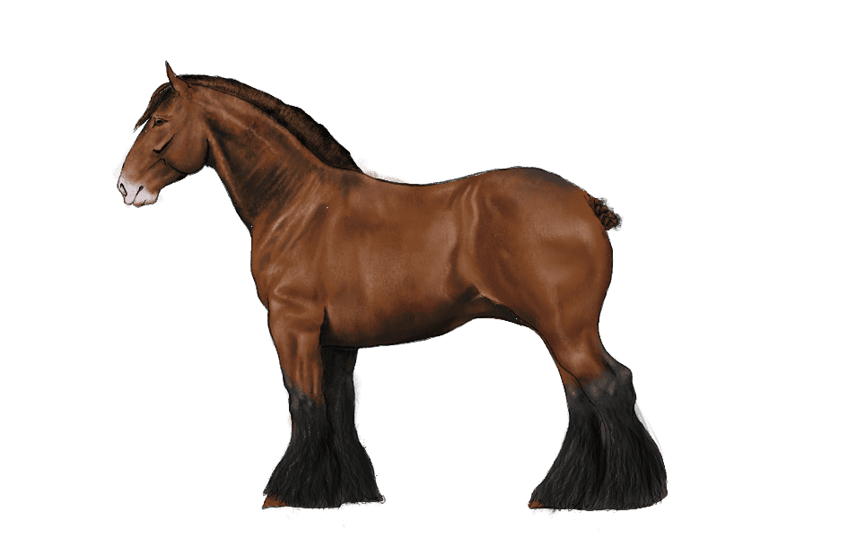
EQUFIGUS
LOGO
The logo went through several stages of design all resulted in something that referred to the equestrian world but with a mysterious and magical side since it is mainly aimed at children.
This is the first venture in the United States, the idea arises from uniting my passion for equestrian art and that of my wife to educate and entertain young horse lovers.
In this project everything is thought out and designed by Schreiterer Studio (with the advice in some areas of my wife Azul Victoria Lorenzo) first I raised the idea of making an album of collectible stickers with the best riders and their horses but then the idea turned to something more educational due to the complication in car rights with the names and images to give rise to horse breed.
PROCESS FOR ILLUSTRATIONS
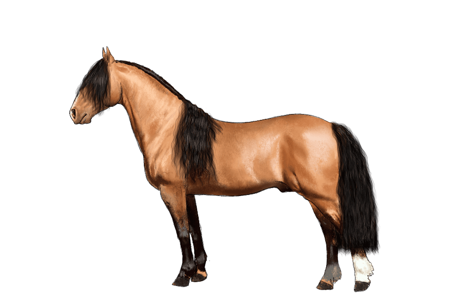
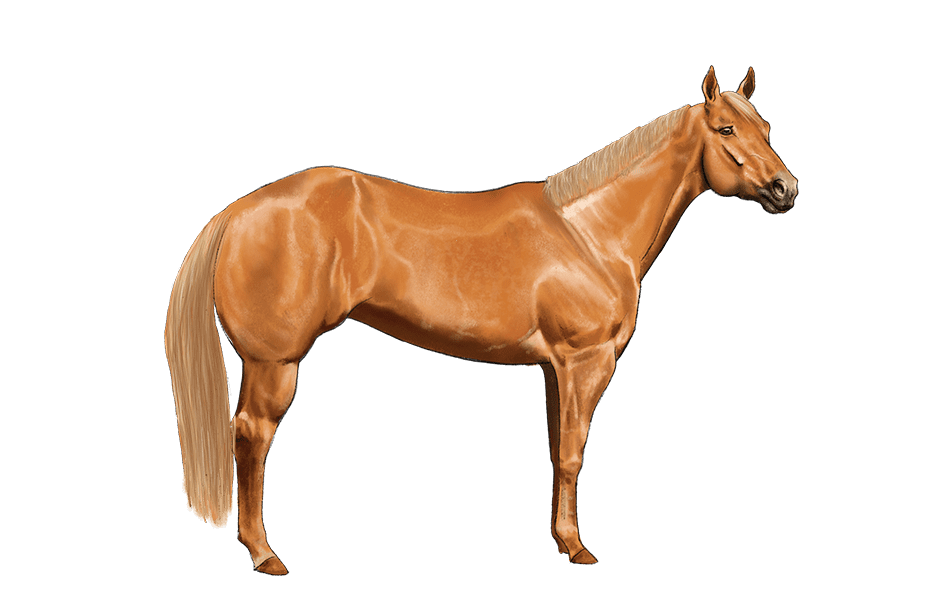
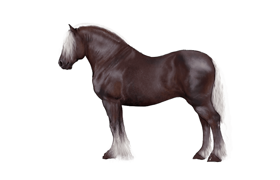
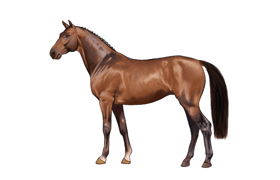
The process for the realization of the races was as follows, we defined which races would go inside, which were the most representative, then a search for references in photography of each one was carried out and a photoshop assembly for each race to avoid copyright problems. Then the illustration work began on a 12.9′ iPad Pro model A1876 with a storage capacity of 512 gigabytes and the appel pencil generation 1 and 2.
The size is 945×610 pixels 264 dpi. Work on one layer the outline then flat color of average value and then the brightness and shadows for the volume. In the case of breeds with spots and other motifs, a separate layer was made. The manes were made with special brushes to paint hair, to optimize production times.
